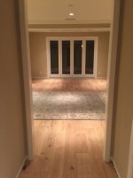
I'm choosing the interior paint color for my new home. Thus far we have chosen Fading Fog VP-8307. Realizing that a large wall will look different than a small paint sample we are a little worried that grey tones might be too depressing over the long term. Grey tones seem to be the "hot" choice now but that might change over the future.
Time for some opinionated TIers to chime in!
Time for some opinionated TIers to chime in!